
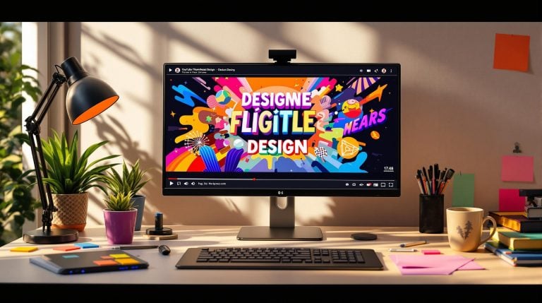
Want more clicks on your YouTube videos? It starts with your thumbnail. Thumbnails are the first thing viewers notice, and by 2025, 70% of YouTube views happen on mobile devices. This means your design needs to grab attention instantly, even on a small screen.
Here’s what makes a great YouTube thumbnail:
- Size and Format: Use 1280 x 720 pixels with a 16:9 aspect ratio for best results.
- Visuals: Bold colors, high-quality images, and clean designs are key. Avoid clutter.
- Text: Keep it short (3-4 words), use bold fonts, and ensure readability with strong contrast.
- Consistency: Stick to your branding – colors, fonts, and logo placement should be uniform.
- AI Tools: Platforms like ShortsNinja can help you test and optimize thumbnails quickly.
Faceless content? No problem. Use bold icons, action shots, or abstract graphics to stand out. Always test your thumbnails on mobile devices and track performance data to improve click-through rates.
A great thumbnail is more than a pretty picture – it’s your first chance to connect with viewers and drive engagement.
How To Create Thumbnails That Actually Get Clicks
Components of an Effective YouTube Thumbnail
Creating thumbnails that encourage clicks requires attention to a few key design elements. Let’s break down what makes a thumbnail stand out.
Visual Appeal: Catching the Eye
High-quality visuals are the backbone of a strong thumbnail. Stick to YouTube’s recommended dimensions to ensure your thumbnail looks great on any device [1][2].
Use bold colors and clean, simple designs to grab attention. Pairing complementary colors, like blue and orange, can create striking contrast. Choose images that stay sharp and clear, even when scaled down [1].
Text and Graphics: Keeping It Clear
Thumbnails with text should deliver a clear and concise message. Use large, bold fonts that are easy to read, even on smaller screens. Strong contrast between text and background – like dark text on a light background or vice versa – makes a big difference [1][2].
Keep titles short, ideally 3-4 words, and use subtitles sparingly. Calls-to-action should be brief and to the point. Graphics should serve a purpose, staying minimal to emphasize the video’s main message [2].
Consistency and Branding
A consistent thumbnail style helps your content stand out in a sea of videos. Stick to:
- Color schemes that reflect your channel’s branding
- Fonts that remain the same across all thumbnails
- A specific placement and size for your logo
- Design elements that viewers come to associate with your channel [2]
This consistency helps build recognition and trust with your audience. When viewers can spot your videos at a glance, they’re more likely to click, especially if they’ve enjoyed your past content. Studies show that channels with consistent thumbnail styles often achieve higher click-through rates compared to those with random designs [6]. Plus, using a consistent style can save time – creating templates makes the process quicker while keeping quality intact.
With these basics covered, we can dive into strategies for crafting thumbnails for faceless videos.
Strategies for Faceless Video Thumbnails
Now that we’ve gone over the basics of creating effective thumbnails, let’s focus on approaches specifically for faceless content. With 70% of YouTube views coming from mobile devices [5], your thumbnails need to grab attention instantly.
Using AI Tools for Thumbnail Design
AI tools like ShortsNinja make creating thumbnails for faceless content easier. These platforms can generate high-quality visuals, optimize text placement, and ensure your design stays in line with your branding. They help you produce professional-looking thumbnails that also meet YouTube’s technical standards.
Choosing Attention-Grabbing Visuals
When you’re not using faces, your visuals have to work even harder to stand out. Since viewers decide to click in just 0.3 seconds [5], your design needs to leave a strong impression right away. AI tools can assist in picking or creating visuals that align with your content’s purpose.
Here are some effective options for faceless thumbnails:
- Bold icons: Perfect for quick recognition and easy scanning.
- Action shots: Add energy and movement to your design.
- Product close-ups: Highlight details and build trust.
- Abstract graphics: Keep things visually interesting.
Keeping Your Design Consistent
Consistency in design makes your content instantly recognizable. For faceless channels, focus on:
- A color palette that represents your channel’s style.
- Fonts and text placement that are easy to read.
- Matching styles for icons and graphics.
- Backgrounds with patterns or textures that enhance the overall look.
Always test your thumbnails at smaller sizes, as most people will see them on mobile devices [5]. Your design should stay clear and impactful, even when scaled down.
sbb-itb-5c23652
Optimizing Thumbnails for YouTube
YouTube Thumbnail Requirements
For designs heavy on graphics, PNG format is your best bet for preserving clarity. On the other hand, JPEG works better for visuals that are photo-based. Always aim for high resolution to ensure thumbnails stay sharp, even when scaled down. This is especially important since most viewers will see your thumbnails on mobile devices [1].
Improving Contrast and Readability
With mobile devices accounting for 70% of YouTube views [5], making your thumbnails easy to see and read is crucial. To make them stand out, focus on contrast and clarity. Use bold text colors, clean backgrounds, and subtle shadows or outlines to highlight key elements. This ensures everything remains clear, even on smaller screens.
Here are some tips for better readability:
- Use simple, uncluttered backgrounds, and darken areas behind text for improved focus.
- Choose bright, contrasting colors for text to make it pop.
- Keep enough space between design elements to avoid a crowded look.
- Add subtle edges or outlines to separate important elements.
Testing and Refining Thumbnail Performance
Check how your thumbnails appear across different devices, especially on YouTube’s mobile app, to ensure they look sharp at any size. Dive into YouTube Analytics to track click-through rates and pinpoint which designs perform best. Use this data to tweak elements like colors, text placement, and visuals, and improve engagement over time [2].
Once your thumbnails are clear and optimized for performance, you can focus on creating designs that align with viral trends and connect with your audience’s preferences.
Strategies for Viral Thumbnails
Creating viral thumbnails is all about combining smart design with trends to grab attention and boost viewer engagement.
Adding Trends to Thumbnails
Thumbnails that tap into popular design trends can make a big difference. With viewers deciding whether to click in just 0.3 seconds [5], your thumbnail needs to make an instant impression.
Here are some elements to focus on:
- High contrast visuals and clear focal points to stand out, especially on mobile screens.
- Eye-catching details like countdown timers or mysterious objects to spark curiosity.
- Designs that align with current trends in your specific niche.
If you’re a faceless creator, you can still stand out by using bold icons, striking colors, or abstract graphics instead of personal images.
Testing Thumbnails with AI
AI tools make it easier to test and improve your thumbnails. Platforms like ShortsNinja can automate A/B testing by generating thumbnail variations and analyzing which ones drive better engagement.
This method works: Derek Muller of Veritasium boosted his views by 50% just by optimizing his thumbnails [7].
Learning from Viewer Feedback
Understanding what your audience responds to is key. Keep an eye on metrics like:
- Click-through rates and how they vary across different designs and devices.
- Average view duration to see how well thumbnails match viewer expectations.
- The tone of comments about your thumbnails – are they drawing in the right audience?
With 70% of YouTube views coming from mobile devices [5], make sure your thumbnails are effective on smaller screens. Use YouTube Analytics to identify your best-performing designs and adjust your strategy based on the data.
Conclusion: Effective Thumbnails for Better Results
With over 2.3 billion active YouTube users watching 1 billion hours of content every day [3], making your videos stand out is more important than ever. A well-designed thumbnail can make all the difference.
Using high-contrast visuals and negative space effectively grabs attention in crowded feeds. Tools like ShortsNinja simplify the process, allowing creators to test and find designs that connect with their audience.
Consistent thumbnails also play a huge role in building trust and recognition. This is especially crucial for creators who don’t appear on camera, as a strong visual identity becomes their signature. Some key elements of successful thumbnails include:
- Clear focal points to draw the viewer’s eye
- Readable text, even on small mobile screens
- Bold color contrasts for maximum impact
- Consistent branding to tie your content together
Leverage YouTube Analytics to track how your thumbnails perform and adjust based on what works. Whether you’re just starting out or already established, focusing on thumbnail design can have a big effect on your channel’s success.
FAQs
Should I put my face in the thumbnail?
Using faces in thumbnails can boost click-through rates on YouTube. Thumbnails featuring human faces often create an emotional connection, encouraging viewers to click [4].
Your decision to include faces should depend on the type of content you’re producing:
When faces work well:
- Personal branding, tutorials, vlogs, and product demonstrations benefit from face-based thumbnails.
When to skip faces:
- Content like gaming, animation, news, or product-focused videos often performs better without faces.
For thumbnails without faces, focus on bold and eye-catching visuals. Use simple backgrounds and make sure any text is easy to read [1]. Key design tips include:
- High contrast between elements
- Clear, readable text overlays
- Clean, uncluttered backgrounds
- Consistent branding elements
AI tools can help you test different thumbnail designs to find what works best for your audience [2]. Experiment with variations in text placement, visuals, and overall layout to fine-tune your results.
Whether you use faces or not, the goal is to create thumbnails that connect with your audience and encourage engagement. For creators avoiding faces, strong visuals and consistent branding can be just as effective.